THE 2024 SHORTLIST
8 designs were shortlisted for the 2024 Manser Medal.
The winner of the Manser Medal, and of the other category awards, was announced at a celebratory dinner event at a new venue this year – Park Plaza Westminster Bridge, London – on 3 December 2024
The Manser Medal 2024
Those nominated for the shortlist are: (click image to view more info)
The Shortlist for 2024
Ardoch by Moxon Architects
Aberdeenshire, Scotland
“At the end of a very steep climbing track (Ardoch’s) fields command what must be one of the finest views in the Scottish Highlands”
Tom Weir, ‘Weir’s Way’ Series 1, Episode 34: Royal Deeside July 14, 1987 STV (UK)
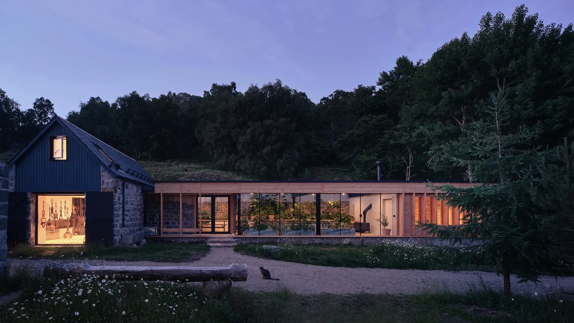
Overlooking the River Dee between Crathie and Braemar in the Cairngorms National Park, the compact hillside fermtoun (farm settlement) of Ardoch has been restored, reinstated and reinvented for the 21st Century. Using a combination of traditional and contemporary construction methods each of the buildings have been transformed for the 21st-century, developed to meet modern standards of energy efficiency, while remaining sympathetic to the original craftsmanship and the surrounding Highland vernacular of the North East of Scotland.
The largest building on the site has been repurposed to give additional study and living space to the client’s main residence, while providing self-contained guesthouse accommodation for visiting friends and family. Beyond a principal entrance and kitchen space, a living room and study occupy one double-height wing of the solid ‘L’ plan granite and slate building, while a ground-level bathroom suite and upper-level loft bedroom complete the adjacent wing.
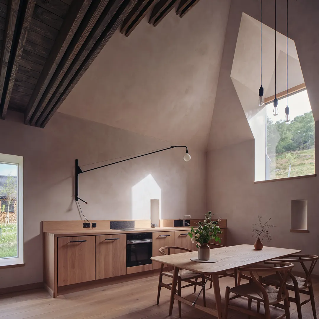
The partially collapsed walls and roof of the original 19th-century cattle shed have been carefully rebuilt, inserting frameless glass within the original apertures to preserve the building’s vernacular detail and form. Using the pre-existing volumes as a template for the new living spaces, the interior has been fully insulated and lined with clay plaster to give a seamless, spacious feel, while oak joinery conceals modern appliances and fittings preserve a minimalist rural aesthetic. The bathroom features ceramic clad walls and dark black-grey Caithness slabs. A new roof emulates the original construction techniques, introducing a newly rationalized pyramidal geometry at the hip, while the hayloft entrance and ventilation slits for the former cattle byre define the guesthouse entrance.
A formerly collapsed farm store and sheepfold at the rear of the site has been reinvented as a glasshouse, partially embedded into the bedrock of the hillside by a pre-existing retaining wall. The original granite structure now serves as the backdrop to vines and lemon trees, and as a thermal store, soaking up heat from the new southwest facing glass wall and roof that complete the enclosure. Steel portals support the roof, with large section Douglas fir fins define a sheltered external space at one end and a secluded exercise room at the other.
The glasshouse is the product of collaboration between the artist/architect owners, joiners Jacek and Waldi Zapała and steelwork fabricator Craig Monteith. Iteratively designed bespoke lighting is clamped to the glasshouse’s steel beams. Water for irrigation of plants is collected from the roof and stored in an internal tank which overflows to an external water butt carved from a windblown larch tree, and internal condensation is collected by a copper gutter and distributed into a bay tree planter. Ventilation is adjusted by large opening hatches along the top back edge of the building while supplemental heating can be provided by a wood burning workshop stove.
Bury Gate Farm by Sandy Rendel Architects
West Sussex
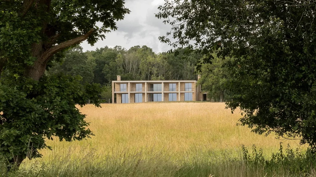
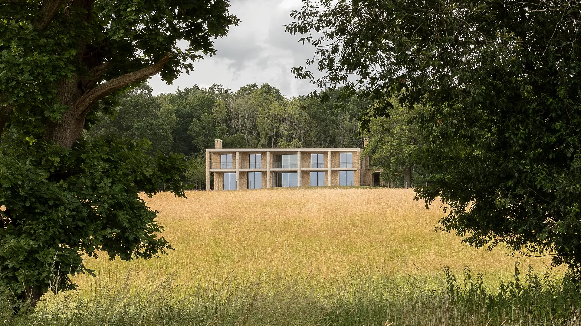
This new 5 bedroom dwelling replaces a dilapidated 1950’s bungalow in the South Downs National Park near Pulborough in West Sussex. Set on rising ground and against a dense wooded backdrop the site opens up to the south and west offering expansive views towards the Downs.
The heavy clay soils of this part of Sussex provide an unproductive agricultural landscape which have encouraged its historic recreational use as landscape parks. With this in mind the house has been developed to read as a modern reinterpretation of a villa/small country house within a parkland setting rather than a traditional farmhouse. Though more modest in scale it takes cues from local examples such as at Bignor Park and Burton Park and offers a strong formal façade to the primary southern elevation.
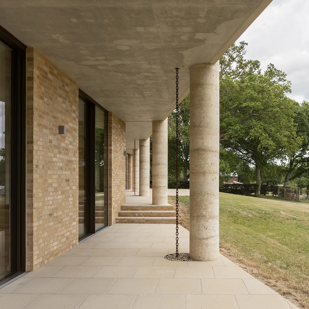
The loose stepped plan is ordered by a 2-storey colonnade providing a classical and rhythmical face to the wider landscape. The fields to the south (which are also owned by our client) and their mature oaks are purposefully drawn into the composition to establish the parkland feel and ground the house within the broader setting.
The simple palette of waterstruck brickwork laid in lime mortar, rammed and precast concrete was chosen to reflect the tones and textures of the local sandstones used widely in the vicinity which vary from light grey to buff to green and even rust coloured ironstones. These mute tones sit calmly against the backdrop of the woodland behind and are further softened by the rich wildflower meadow planted roofs.
This is a highly sustainable house in terms of energy use with an EPC A rating and which generates a surplus of electricity compared to its demand from onsite renewables. It is supplied by a large rooftop photovoltaic array with space heating and hot water provided by Air Source Heat Pumps and is ventilated with a whole house MVHR system.
It is a self-build project, built over an extended period, with our client acting as main contractor and direct employing specialist subcontractors.
Common Villa by Gundry + Ducker
London
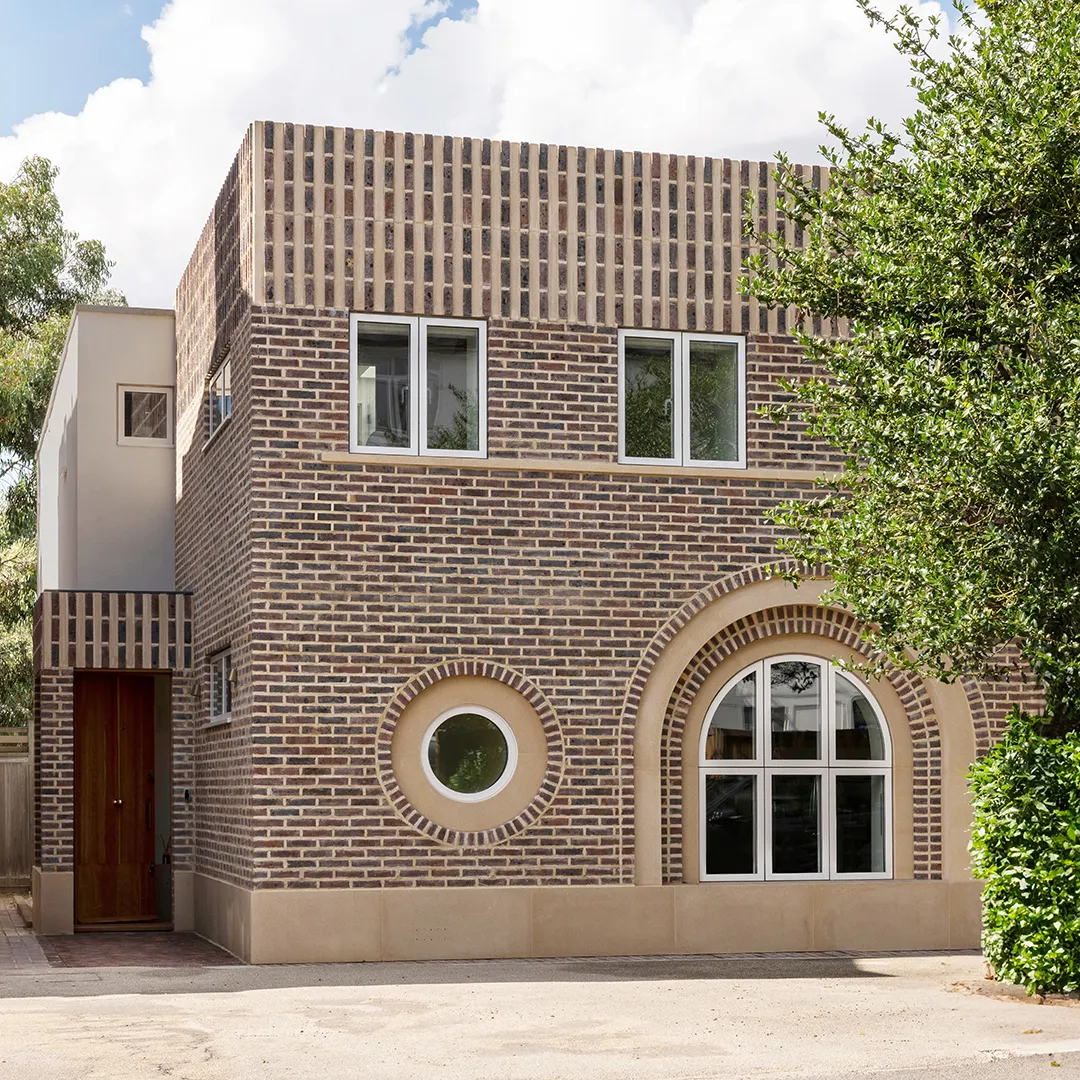
Located near Wimbledon Common, the scheme is a transformation of an early 2000s detached house. The scheme comprises a new façade, porch, infill extensions, and a complete interior remodel. The idea was to create a “country house in miniature”, adding spacial drama and material richness but on a human scale. The internal plan is based on the arts and crafts layout of a central double-height hallway from which rooms are oriented to the north or the south according to their use. Social to the south and private to the north.
The layout is based on issues of orientation, daylight, sociability and privacy, with a combination of open plan and cellular space. It is designed to celebrate the movement throughout the house and provide a sequence of rich and satisfying spaces. Sitting within an area characterised by the individual Edwardian villa, the new facade is intended to be a contemporary interpretation of this form whilst having a relationship with the adjacent listed building.
This is in contrast to the existing, which would best have been described as a built diagram of what could be maximised on site while considering constraints like overlooking and rights to light. This resulted in a poorly lit house with a poor layout and a very awkward relationship with the space around it.
Peckham House by Surman Weston
London
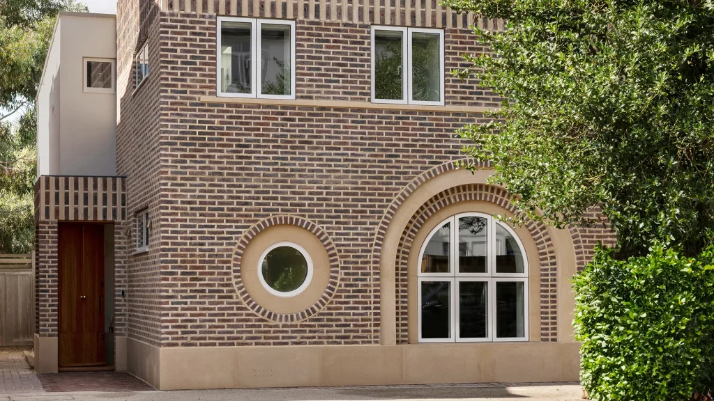
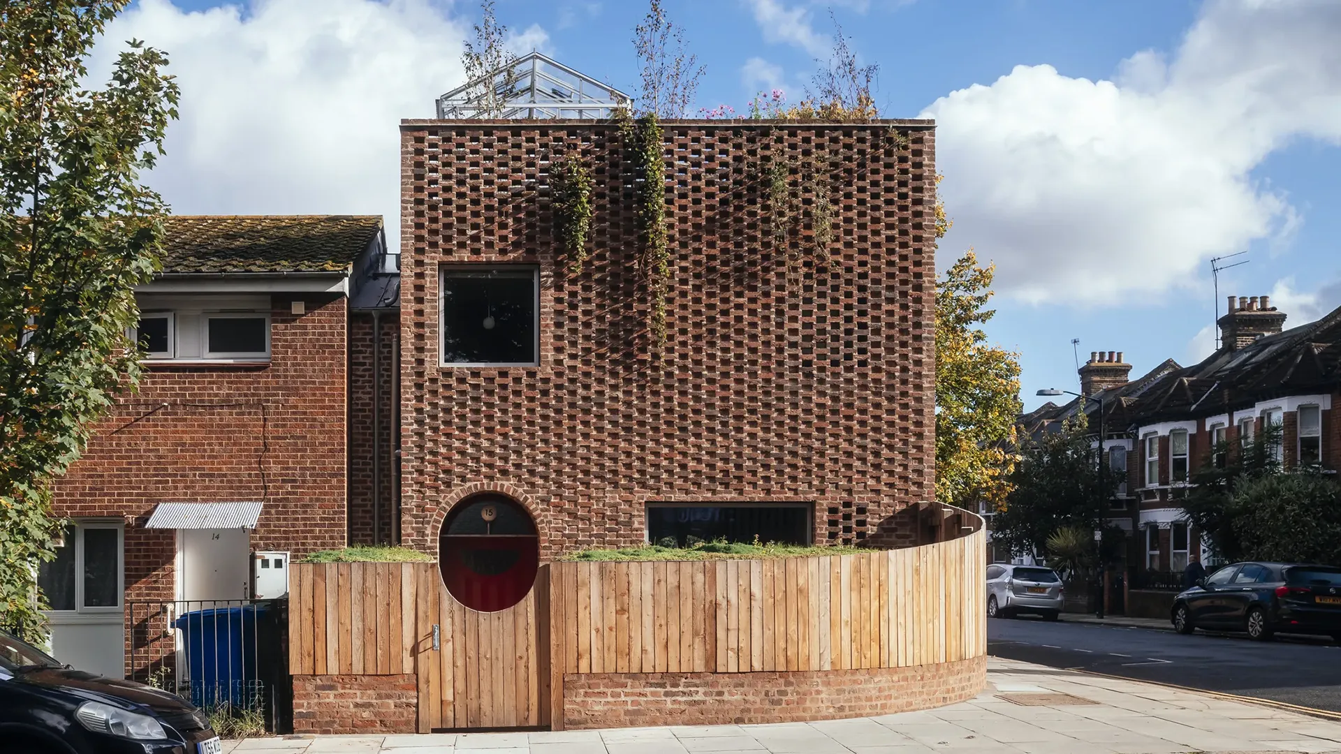
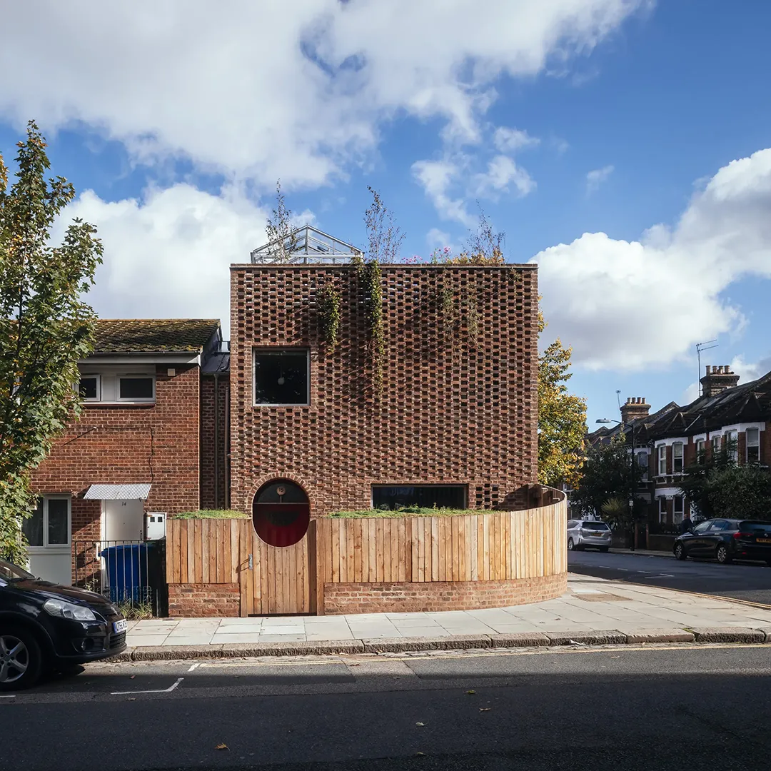
This new self-build house, monolithic in its form and veiled in a distinctive hit-and-miss brickwork, is delicate and crafted as it references and playfully subverts the motifs in Peckham’s vibrant and eclectic urban neighbourhood.
Spanning five years, Peckham House is our first self-initiated project working as client, architect and contractor, affording freedoms and broadening our experience beyond the parameters of a traditional architectural project. Self-building allowed us the opportunity to set the brief, manage the budget and build, and hone and improve the design during construction. Stepping into the role of contractor has rebooted our passion for making, which has always been a principal design driver for us, as demonstrated in many of our projects including the AJ Retrofit Award-winning Hackney School of Food.
The site is located at the end of a short two-storey terrace built in the 1970s, facing Victorian terraces of Moncrieff Street and Peckham Levels, a brutalist multi-storey car park turned creative hub. In plan the new house aligns with the existing terrace, allowing for front and back gardens. However, its form is a clear departure from the established double-pitched roofline, bookending the corner. The flat roof echoes the roof of Peckham Levels and creates a third, more secluded garden in the form of a roof terrace, which is crowned with a glass greenhouse.
The house is designed with a brick façade referencing the handmade stock of the Victorian terrace and the hit-and-miss panels of the car park. As you ascend the house, the header bricks gradually set back further and further, forming a gradient of shadow, until they disappear entirely at roof level, revealing trees and climbing plants. The uniformity of the exterior is softened with self-supporting arched openings to the front and rear, a nod to the nearby railway line and the arched detailing on the former car park.
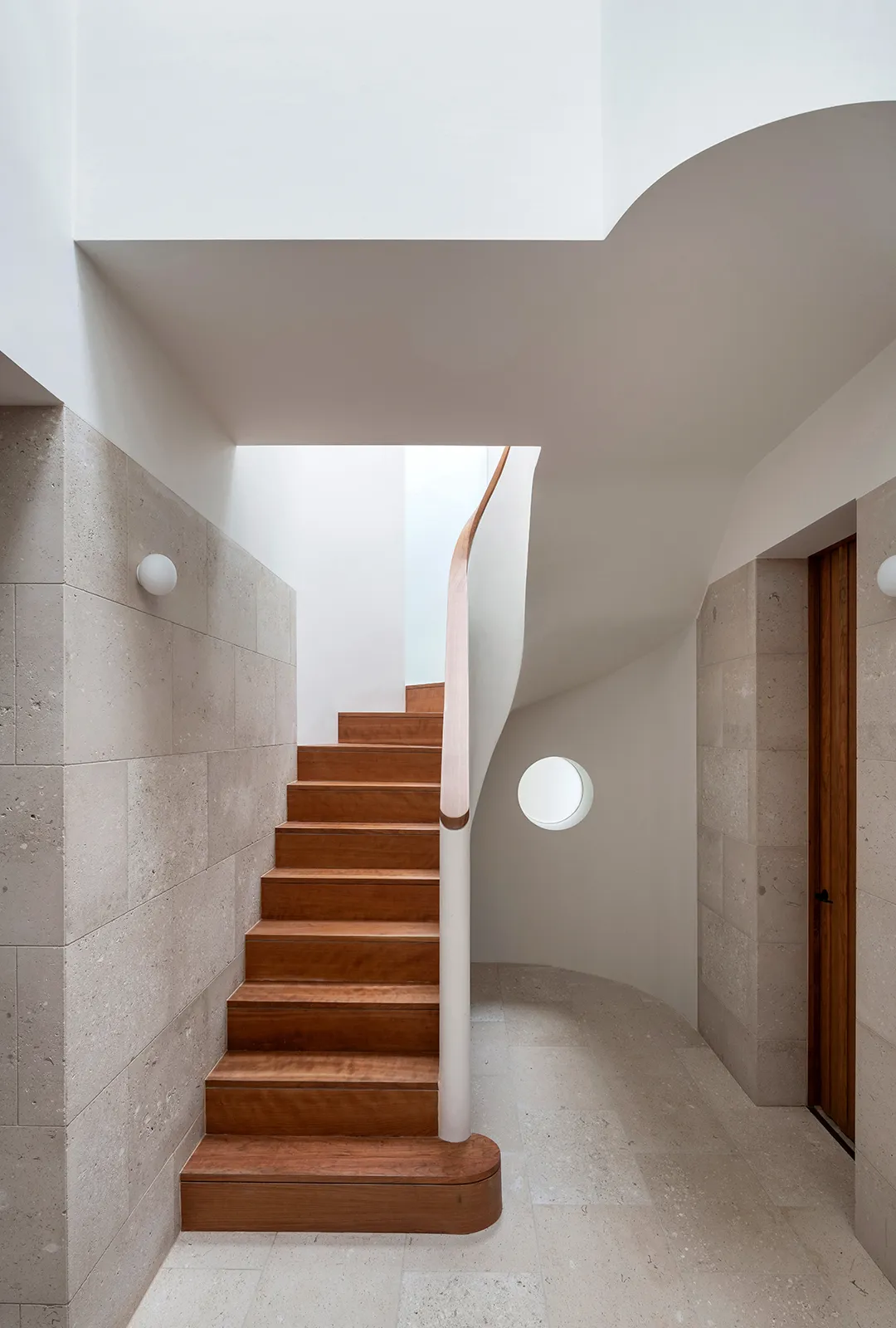
Openings and entrances are carefully configured to ensure an engagement with the street, whilst offering privacy and a sense of enclosure. Inside, the layout follows the blueprint of the enfilade of reception rooms in a traditional terraced house. Materials help to delineate the spaces: terrazzo for the entrance and kitchen; English larch end grain floor (made using offcuts from the timber floor joists) for the reception spaces; lime slurry on the walls of the ground floor; Tyrolean flicked lime lining on the underside of the stairs; and a warmer pink gypsum plaster paired with simple and economical pine floorboards for the more private bedrooms.
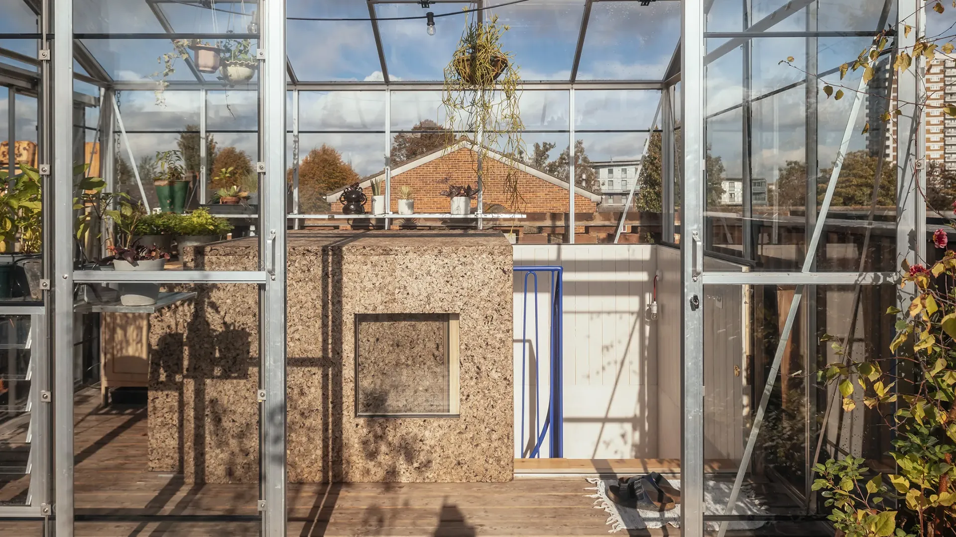
At roof level, you emerge into the greenhouse via a sliding hatch which is clad in a thick insulating layer of cork. This sheltered space offers a multitude of uses – from a plant hot-house to a laundry drying area to a dining space – great for the chillier evenings in the spring or autumn. The greenhouse opens out to a roof terrace surrounded by deep flower beds and a sedum green roof, creating a lush, elevated garden oasis, a biodiverse haven to retreat from the bustle of Peckham.
Reciprocal House by Gianni Botsford Architects
London
Reciprocal House is ‘locally adapted’ to its context much like a species would adapt and evolve to perform better in differing contexts. This approach, starting with the forensic analysis of a site, whether in an urban setting or not, allows nature to lead the design process, providing living spaces embracing light, views, fresh air and privacy. Cities can successfully densify if these issues are incorporated as a driver for a project and an understanding that sustainability starts by providing somewhere one would want to live.
In 1968, the Architect Norman Foster extended a former coach house behind a pub in Hampstead, London, with a lightweight structure of steel, concrete blocks and large span glazing. It is one of the first built structures by Foster & Partners and clearly expresses the approach they would take with an uncompromising simplicity, directness and economy of means. The adjacent coach house was also refurbished at the same time and lived in for over 50 years by the original client.
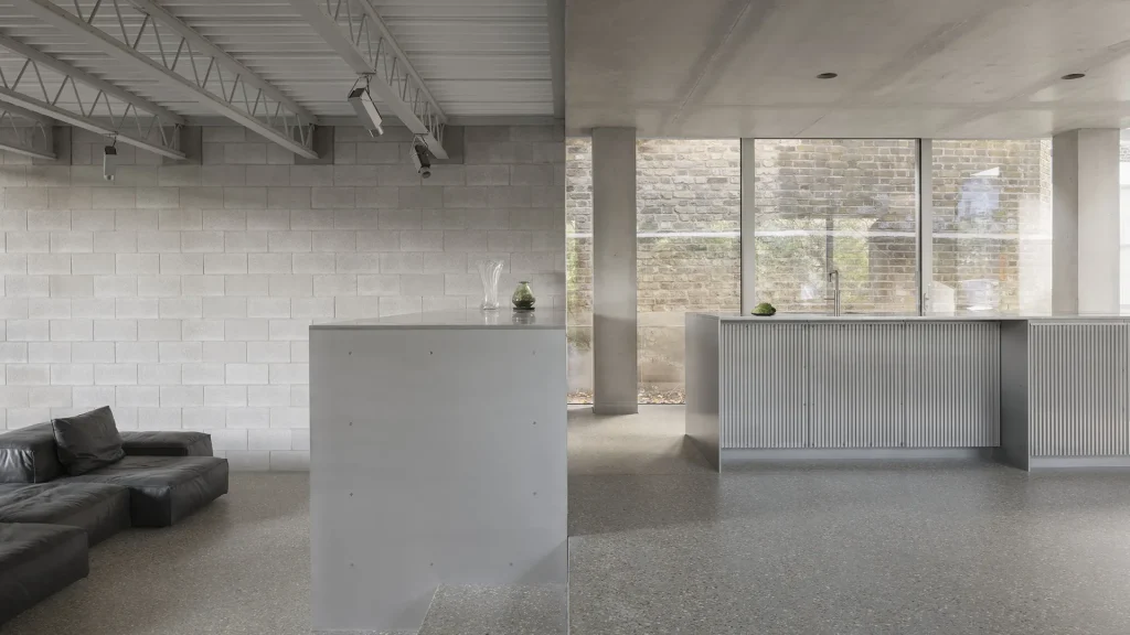
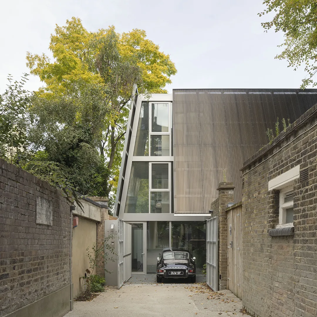
The project retains the original extension, and replaces the coach house, essentially extending the extension. The new extension, on basement, ground, first and second floors, evokes elements of Foster’s treatment of the coach house and the original roof forms with angled facades, but also responds to the extension in its straightforwardness and careful calibration of space. A reciprocal relationship with the architectural character of the Foster extension is formed by the use of a limited palette of materials, an optimised and exposed concrete structure, and veiled views of the context framed by perforated aluminium sail-like roofs that control privacy, as well as preserving a memory of the original building.
The original extension required upgrading both structurally and environmentally and is returned closely to its original state. Inserted into the exposed concrete frame of the new house are highly crafted aluminium interior elements, formed both digitally and manually, that acknowledge an approach to invention represented in the original extension with a singular use of a material and exploration of the opportunities this affords.
Through the process of reinvention, the evolution of the retained, demolished and newly built structures speak to architectural history, layering and respect.
Six Columns by 31/44 Architects
London
Six Columns is a house for one of the Directors of 31/44 Architects designed to accommodate their family within their existing neighbourhood.
The project began in late 2015 after approaching a neighbour regarding selling their large side garden. A planning application followed in 2017, time was spent adjusting and detailing the design and the project began on site late summer 2019. Constructed mainly through the covid 19 pandemic the family moved in for Christmas 2020 before achieving a ‘completion’ in spring 2021. However, the ethos of the house is that it will always remain unfinished, the notion of a perfect dwelling, getting it right from day one, does not sit right. Whilst refined completion is what we strive for with clients this house was to be more loose fit, the brief was an interior that could adjust to future requirements and tastes. This strategy, facilitated by a Brutalist application of materials allowed careful control of the budget. Simply finished bespoke joinery allows easy adaptation over time. Avoiding precise paint finishes and employing oiled pine with details inspired by Enzo Mari’s self-design furniture project, Autoprogettazione, and early modern joinery by Le Corbusier.
In plan the design began by resolving the site conditions. Following the existing pattern of the street the house steps forwards and twists to resolve a change in the character of the boundaries while accommodating a large existing tree to the rear. There are two gardens separated by a light-filled kitchen and living space. A south-west facing sunken court features an outdoor kitchen mirroring the main kitchen.
The house is discrete and considerate of the setting, but not meek in its character or detail. From a distance it sits comfortably alongside its neighbours, as you approach and enter its character shifts.
The architectural language is highly personal, a house of memories perhaps. From borrowed character of the house next door, abstract references to places visited and shared, buildings long-admired and memories of houses inhabited over the years.
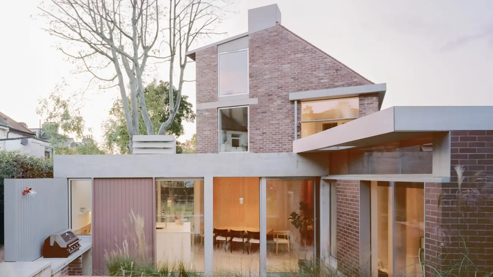
A stepping brickwork wall, ‘rustication’ and ‘pilasters’ and a green marble panel capture memories of buildings visited but also make a positive contribution to the street; adding detail and a sense of civic luxury to the entrance area. Houses should be a positive contribution to the character of the neighbourhood and the city beyond.
Internally levels are carefully controlled to protect the existing tree and to minimise physical presence. The house sits on a series of screw piles positioned to avoid major tree roots. The ground floor features exposed brickwork and a concrete frame with joinery subdividing the spaces. Upstairs the internal masonry is replaced with a timber frame with open loft volumes. The house is triple-glazed and features an air source heat pump.
The house prioritises shared spaces to gather across its three floors and minimises individual sleeping spaces. There are very few corridors and a deliberate strategy to make contained rooms complemented by more open areas. Part farmhouse and part Californian Case Study House.
Station Lodge by Lacey & Saltykov Architects
London
The client/architect bought the site in 2020 to develop as a family home for two reasons:
– Give their two teenage daughters more space to study and socialise. Their previous home – a 15-minute drive away self-built in 2010 (award-winning/published in AJ) had different size/shape bedrooms – good for small children, but less equitable as they went into secondary education
– To be closer to their new school and football training for AFC Wimbledon Girls
A vague initial aspiration for potential future split into two properties (for each daughter) just before starting construction became a necessity due to significant pandemic-induced inflation. The design was tweaked to allow easy future conversion into two three-and-a-half bedroom houses (see above) and make the project financially viable long-term.
Other challenges were to house the client’s extensive book and music collection in a flexible single system, and give exhibition space to a collection of art and sentimental objects in a well-lit space without direct sunlight.
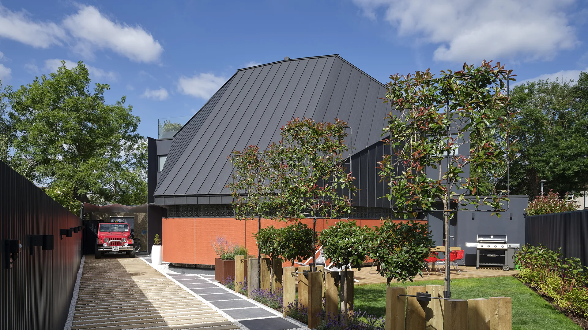
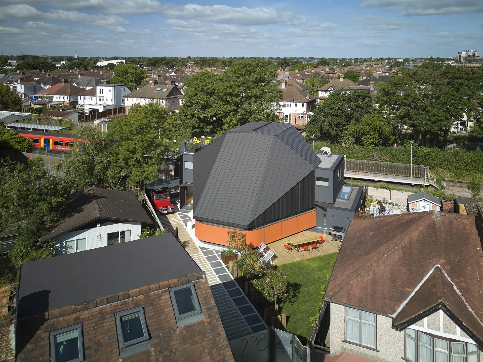
The site is triangular with two sides bound by typical suburban terraces and the third by the Motspur Park railway station. It is further constrained by the rights of way to an adjacent electrical substation.
The client’s previous home had an attractive fully glazed elevated aspect onto a park. No such view was available here – although the animation provided by the station/trains has its own, different quality. To compensate for this; to make WFH post-covid more attractive; and to provide plenty of inside-and-outside entertainment for both adults and children (all of whom entertain frequently), it was decided to maximise the communal area volume and make it interesting visually.
The design response to the above included:
– The conventional first-floor bedroom ‘block’ was placed along the railway built with heavy blockwork and oblique windows to reduce noise; carefully planned so that no future change is required to any of the bathrooms and symmetrical rooms for both children.
– The main space sits at the front following the site’s complex geometry. At ground it has rounded corners to allow for intuitive circulation. Externally it is expressed as a bright horizontal band of coloured mosaic, becoming a continuous library shelving inside; separated from the floor and the roof by two bands of special reflective glass blocks. These give daylight, reduce direct sunlight and prevent overlooking.
– The multi-faceted triple-height roof has fully visible structure inside and expressed waterproofing seams outside with no margin for design/construction errors whatsoever. It ‘sails’ over the bedrooms providing a home office/lounge on the second floor with access to a generous south-facing sundeck.
– The communal spaces flow freely between all floors with ample opportunity to display art and play music, yet are fully separated from the private bedrooms by two-door acoustic lobbies doubling up as discreet access to the bathrooms.
In addition to the front communal garden / external dining deck, there are two small concealed rear ‘private’ gardens – adults’ next to the kitchen/dining/bar; children’s next to their ‘playroom’ doubling up as a guest bedroom.
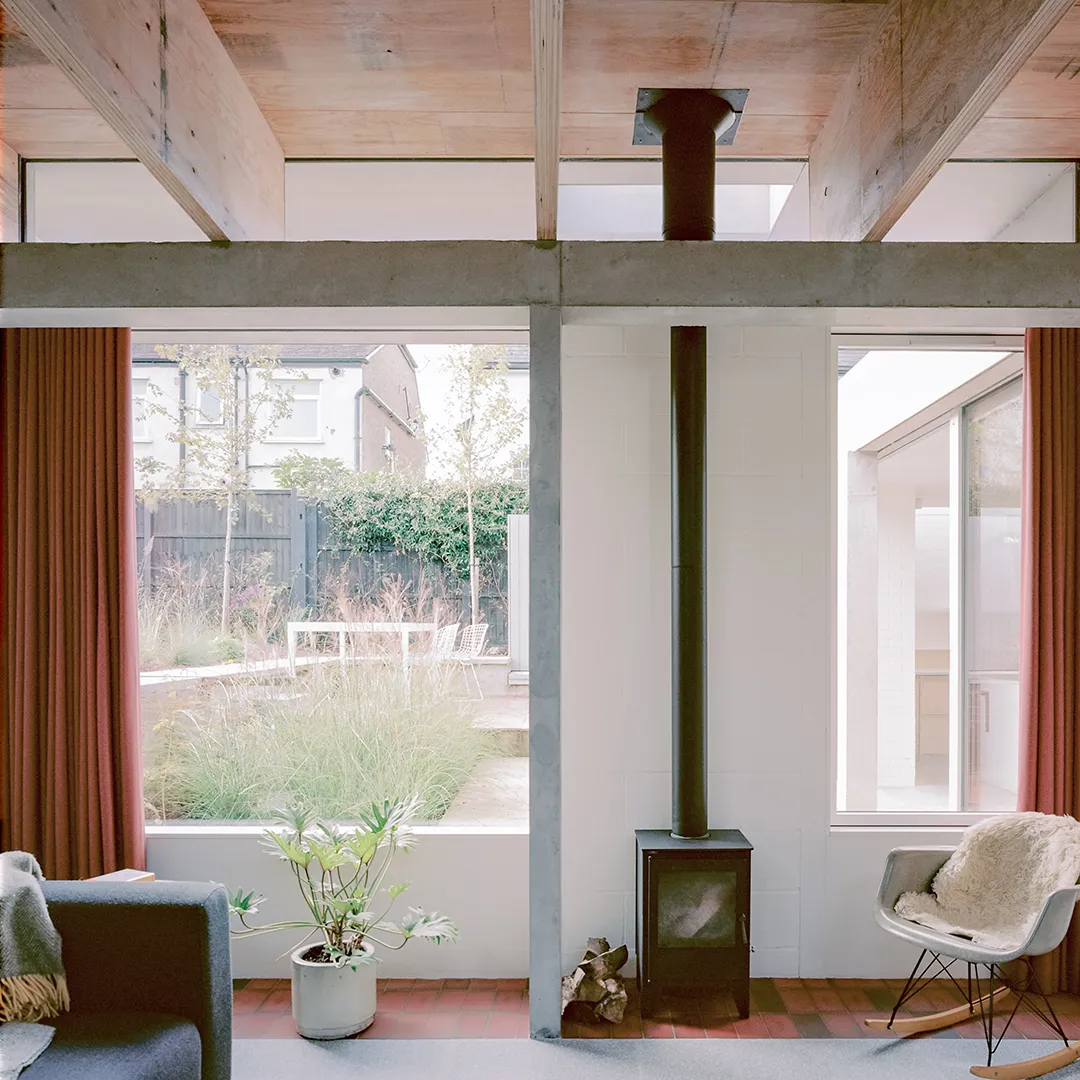
Taper House by Merrett Houmøller Architects
London
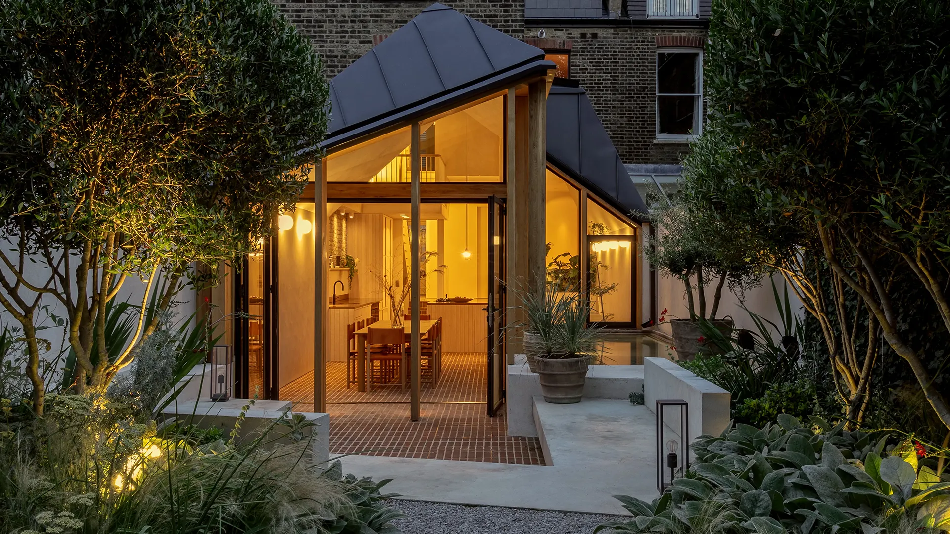
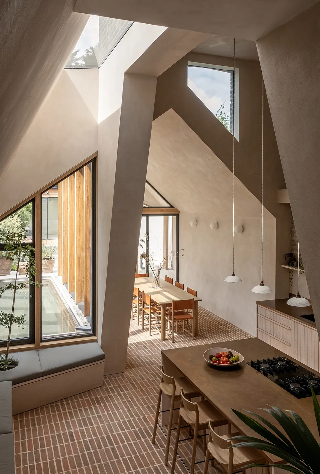
Taper House is a renovated and extended Victorian terrace in London. Departing from conventional townhouse layouts, the design features an interplay of connected volumes. A mix of open and broken plan spaces are opened up with generous double-height ceilings and high level glazing, and a dramatic trapezoidal shaped double-height kitchen and dining space is at the literal and focal centre of the plan. Outside, low garden seating and a rainwater harvesting pond blurs the boundary between inside and out with rippled light from the pond bouncing into the house.
At Taper House, our aim was to break away from conventional renovation ideas and use inspired collaboration to transform the tired-looking Victorian home into a contemporary family home that forms a closer relationship with the garden and natural light. The originality lies in the design of the extension, where tall trapezium shaped internal openings and the addition of pitched forms come together to form calm and inviting church-like spaces. The idea was inspired, in part by traditional Moroccan and Andalusian homes, where a central courtyard is tall and filled with light, with smaller, cosier rooms off to the side. This was achieved by removing some of the original first floor, disrupting the typical rectilinear spatial arrangement of a standard London townhouse renovation. The result was a unique mix of tall, open and intimate spaces.
Integral to the brief was to create something which had a more positive impact on the world than negative. Choice of materials was always based around this; both regarding the environmental impacts and the impact on the sense of comfort and warmth within the home’s spaces. As such, the pallet of materials focused on natural and low carbon materials. Exposed structural oak timber and wide oak board flooring bring warmth to the spaces, whilst acting as a carbon sink. With a high thermal mass, handmade clay brick pavers with a lime mortar cover the floor on the lower areas of the ground floor, extending into the garden where they become permeable paving. Clay plaster is used extensively helping regulate moisture and odours within the air. Walls and ceilings where clay plaster is not used have a lime wash finish. Photovoltaic panels are fitted to the dormer roof, and outrigger roof, providing the majority of the house’s electricity demands and integrated planters allow plants to grow inside, benefitting from the extensive amount of glazing and roof lights which bring light into the centre of the plan. Finally, essential to the initial layout was the idea of a pond which acted as rainwater capture with rainwater pipes emptying directly into it. The pond is visible from all areas of the ground floor, helping create a sense of calm.
